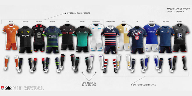
Major League Rugby has unveiled its kit lineup for the 2021 season. Last year’s provider Paladin continues and has produced some striking designs. As they were a year ago, the overall reception has been positive.
In general many teams have opted for similar designs to the 2020 lineup, which makes sense given that the season was cut so drastically short. There are two radical departures, one with a new logo, and of course two new teams. Below we take a team-by-team look at the changes with the expansion sides last.
A comparison of 2018 and 2019 kits can be seen here.
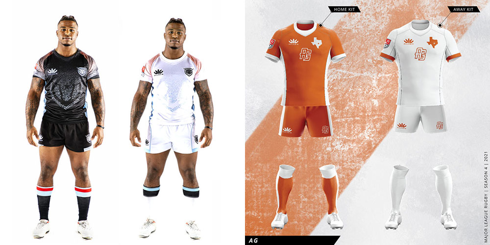
AUSTIN GILGRONIS
The kit that never was… On the left we see the design for the ‘Austin Herd’ before the team was abruptly renamed on the eve of the campaign. In fact the Herd kit was worn in the preseason, but then cast into the realm of collectors items. The 2021 design is in fact virtually identical to the one worn during the 2020 season with one notable exception – the football numbers on the front of the kit are gone. The white strip features orange cuffs and chest logos that were white on the 2020 strip.
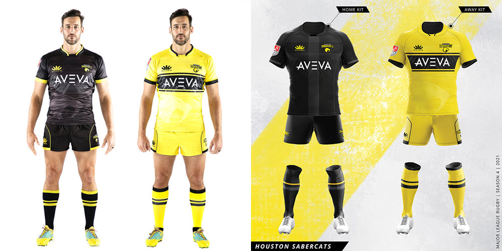
HOUSTON SABERCATS
The SaberCats have also opted for very similar designs. It’s a more classic black strip for the home kit with the sublimated logo discarded in favor of a faded cross pattern. The shorts and socks also cut down on the yellow striping. The away strip is a near carbon copy with only slight design changes around the collar and with added shoulder seams.
NEW ENGLAND FREE JACKS
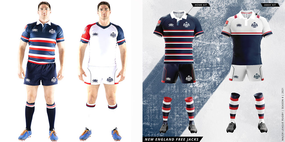
The Free Jacks have done it again. Their collared home strip was the runaway winner as best design for 2020, and it returns in 2021 with thinner and more frequent horizontal bars. The plain blue shorts adopt the away design with a red pocket seam style, and the new hoop socks match the outfit to perfection. Last season’s less inspired away kit has been replaced with a far more impressive navy and white strip complete with the traditional collar. Most place this kit at or near the top in 2021.
NOLA GOLD
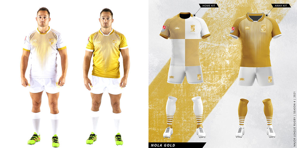
It’s a sharp quartered look for the home option this time with new striped socks a step up from the bland plain white worn in 2020. The away kit is effectively a rehash with a slightly more pointed fading vertical stripe design that is also now carried on the shoulders. To the dismay of some the team has not incorporated the popular Mardi Gras design, though it is likely to continue as a special occasion kit.
OLD GLORY DC
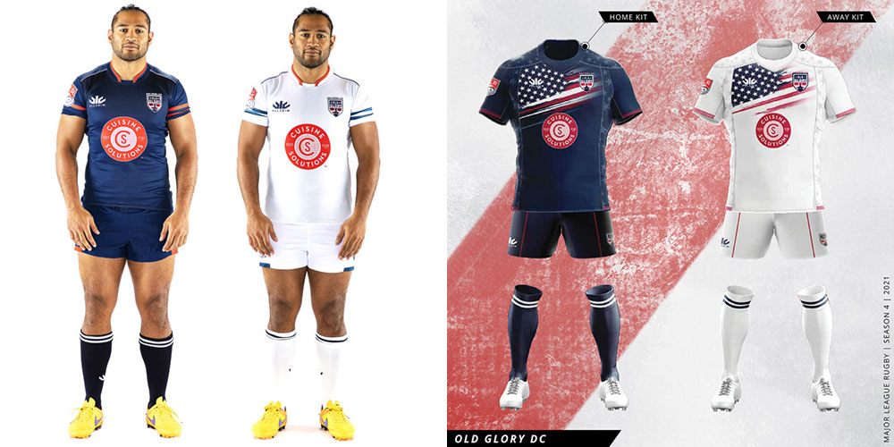
The simple but effective designs of 2020 have been changed significantly. It’s now the stars and stripes forever on Old Glory. Thus far reactions have been mixed, with some opposed to the overly patriotic display with criticism that the design would be better suited for the US Eagles.
RUGBY ATL
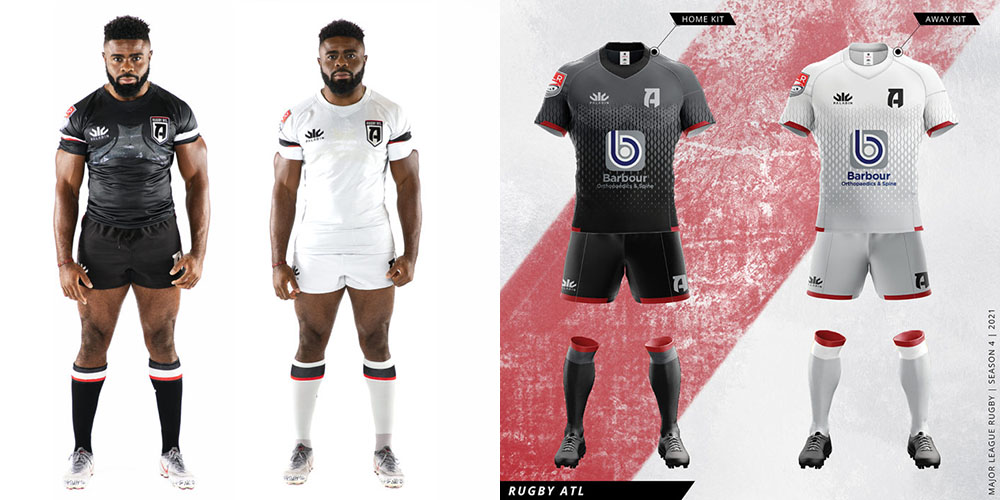
It’s similar yet different offerings from ATL. After presenting a new ‘Ratler’ logo in August, it turns out it’s just an alternate with the stylized ‘A‘ now simplified on the strips instead. There are, as promised, the snake scales that replace the sublimated area map. Both kits incorporate grey fades which is a nice touch, with the grey featured on the socks as well. Prominently displayed on the front are new sponsors Barbour Orthopaedics & Spine.
RUGBY UNITED NEW YORK
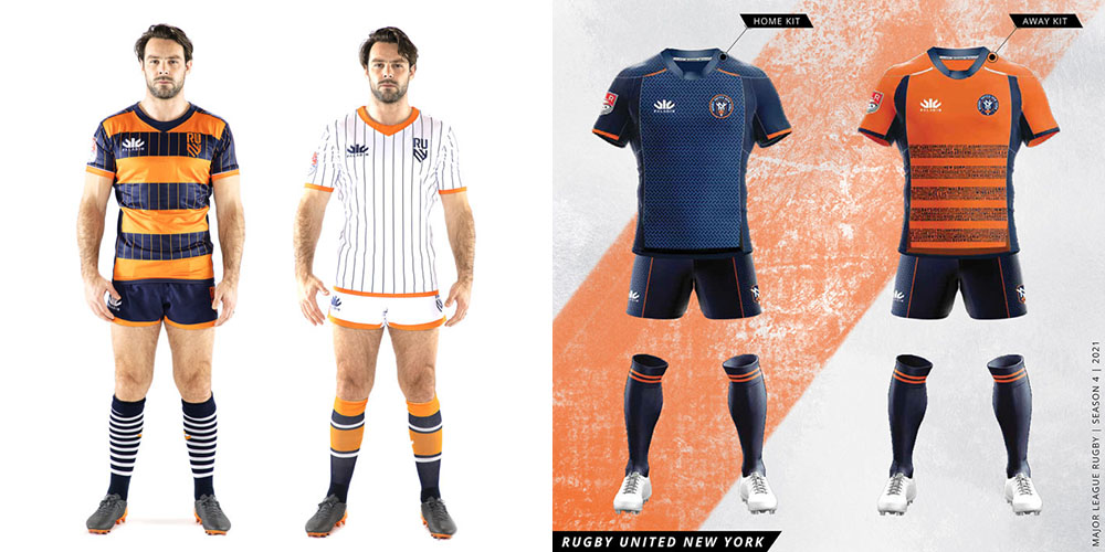
The polarizing pinstripes have been dumped in favor of a blue home strip that harkens back to their original 2019 design. Meanwhile the orange design used at home last year has been re-imagined as the new away strip. Similar to Seattle’s lettering idea, the horizontal stripes feature the names of New York City neighborhoods.
Both kits come with a new logo design, with the old one featured as a small crest on the bench of the neck. Curiously RUNY has described the new design as a ‘secondary‘ logo despite its more prominent primary placing on the jersey.
SAN DIEGO LEGION
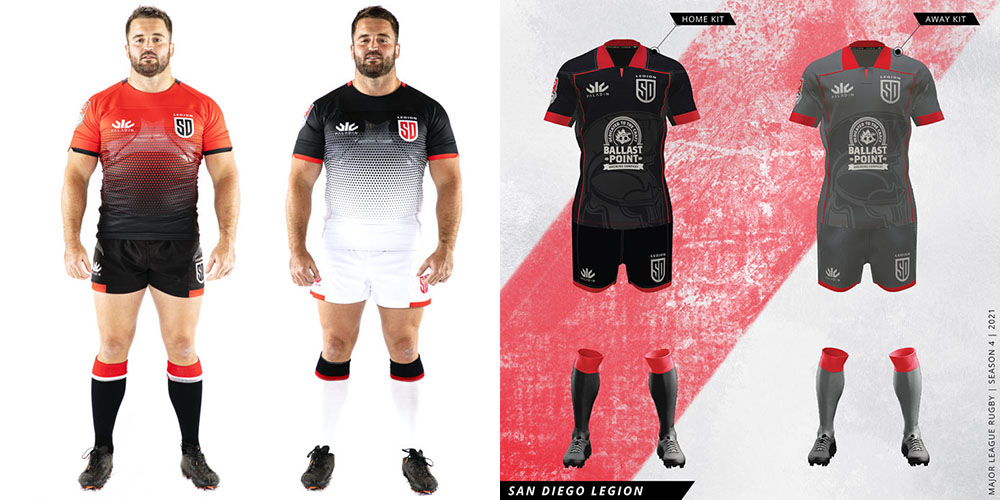
By far the biggest change comes from San Diego, who have moved away from their traditional red and white offerings to black and grey. The stippled pattern is gone and replaced by a sublimated legionnaire design which does look sharp behind the new sponsor logo from Ballast Point Brewing. The red faux-collars are an interesting alternative to New England’s traditional fold. It remains to be seen if fans will take to the new designs. It should be noted that the white 2020 away strip is unique in that it never saw game time before the season was suspended.
SEATTLE SEAWOLVES
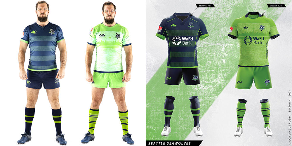
If it ain’t broke, don’t fix it. Some extra accent stripes on the home kit are the only change, though there is a new sponsor for the Seawolves as well in Washington Federal Bank. Fans loved these designs in 2020 and there are no complaints about the re-offer.
TORONTO ARROWS
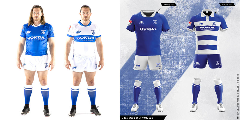
Some have criticised the Arrows for being too conservative . The more refined rugby fan, however, appreciates the classic design. Among the most lauded shirts of the 2021 line are Toronto’s new away strip that features a modernized hoop design with traditional collars and gold numbers on the back, a shout-out to their original Ontario Arrows shirts. The old white away kit has in fact been repurposed as an alternate home shirt, giving Arrows fans three designs to choose from.
UTAH WARRIORS
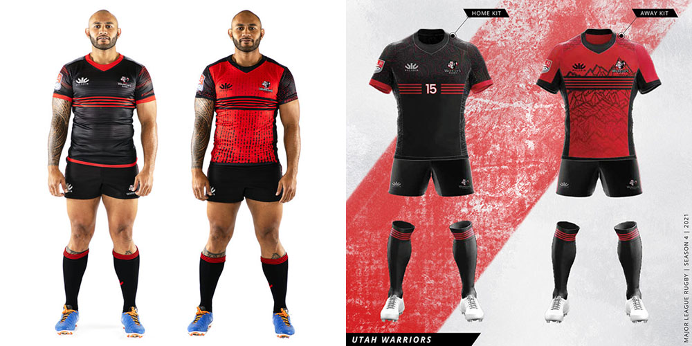
The Warriors have made incremental upgrades each year and take it another step in 2021. In place of the sublimated horizontal lines on the black strip is a Polynesian design, while it appears that the player numbers will go on the front of the jersey though in a far more subtle manner than seen on the old Austin shirt. The red collar and waist bar are also discarded on the home jersey. The red strip replaces the tapered ‘matrix’ lines with a mountain range similar to Seattle’s skyline design.
DALLAS JACKALS
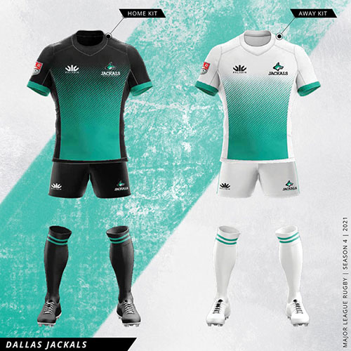
The first of the newcomers use a consistent design for both shirts. It fits the color scheme well and is a solid offering out of the gate. If there is criticism it’s that black jerseys are are getting a little too common across the league especially with San Diego’s change of direction.
LA GILTINIS
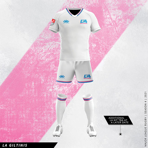
Oh dear. We’re already struggling with the name and the team has fronted up with only a single plain white strip with a note that an additional kit is coming ‘at a later date’. With a stellar coaching staff and a playing roster that looks very promising, it’s time for the marketing gurus to pull up their socks.
 Americas Rugby News Rugby news from across the Americas!
