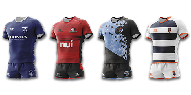
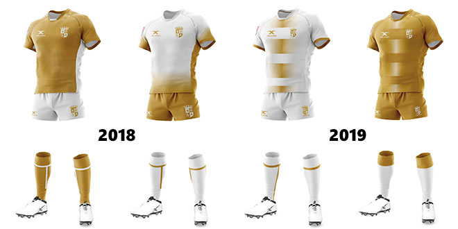
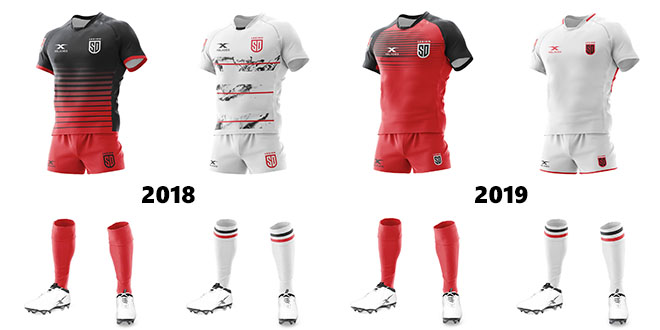
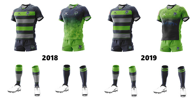
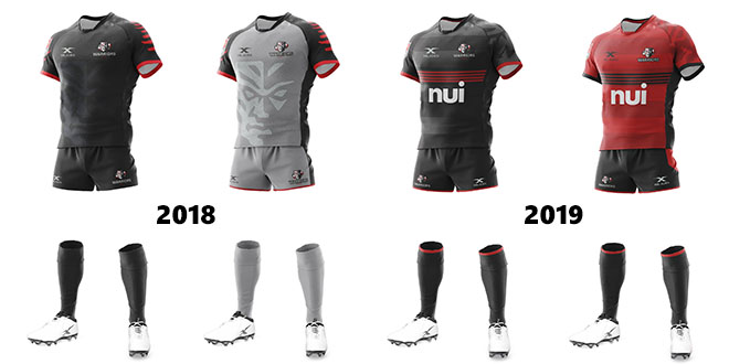
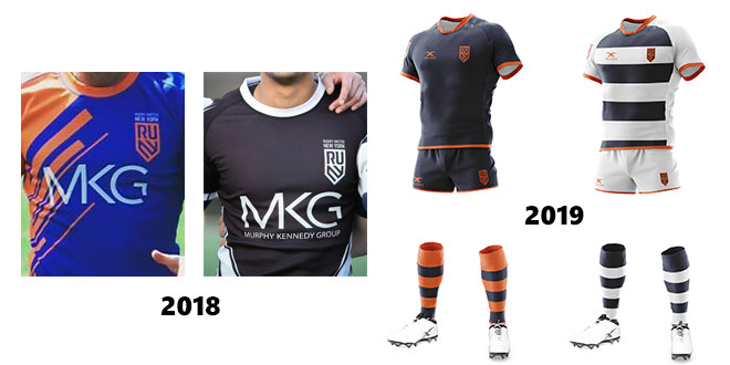
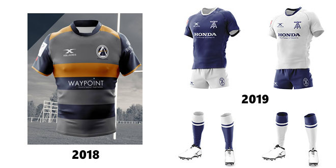
On Friday Major League Rugby unveiled the new playing kits for all nine teams competing in the 2019 season. Both Toronto and New York show dramatic changes to the strips they wore during their exhibition campaigns earlier this year, while some returning teams have also opted to freshen up their look.
While preferences are always subjective, the overall reception for the new kits has been largely positive. The most notable league-wide trend is an increase in white strips. Below is a team-by-team look at the respective transitions with 2018 kits on the left, 2019 on the right in home-and-away order.
The 2019 kits – front and back – can be seen in high resolution here.
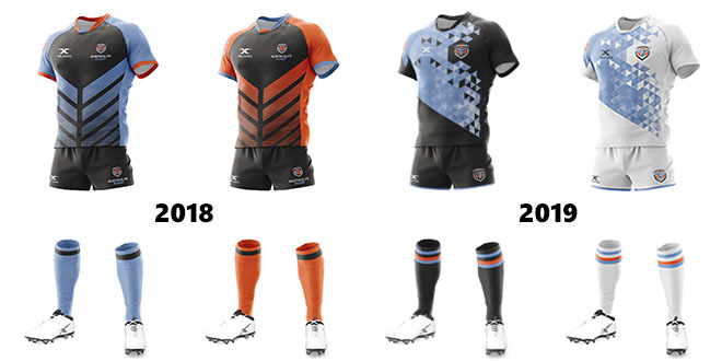
AUSTIN ELITE
Dramatic probably doesn’t do justice to the changes at Austin this year. They have a new home field in Dell Diamond, a heavily altered roster that should see at least half of the first choice team changed, and their kit is the most radical departure from 2018 of the returning franchises.
Last year’s angled stripes are discarded with the tangerine kit out the door completely in favor of an all-white away strip. The new jerseys feature a geometric design with a Texas flag on the back just below the neck line. Even the socks have changed to more traditional black and white options with hoops design.
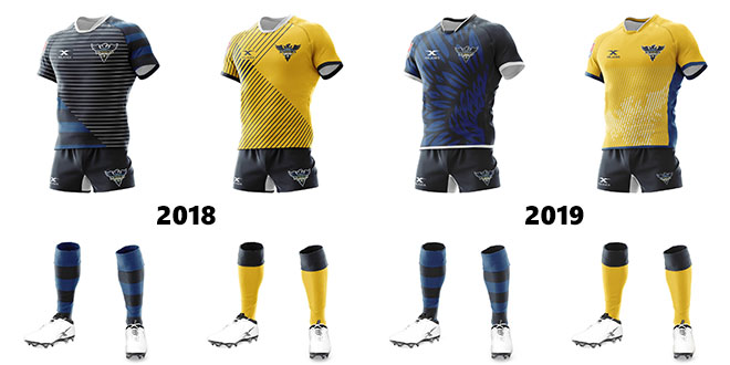
GLENDALE RAPTORS
Glendale have axed the horizontal lines on their home kit and the black angled lines of the away jersey. The home kit shows Raptors feathers wrapping around front and back with the yellow away jersey adopting the logo in its entirety. Shorts and socks remain the same.
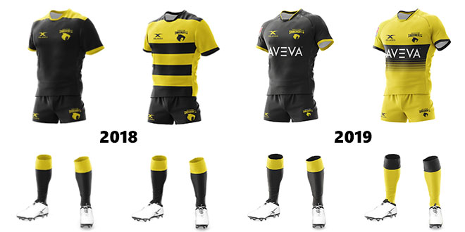
HOUSTON SABERCATS
The SaberCats continue with a restrained design, choosing a clean black look reminiscent of the classic Wasps jersey. There is a departure from the ‘bumblebee’ stripes on the away jersey to a more modern faded approach. Yellow shorts and socks are added to the away kit.
NEW ORLEANS GOLD
NOLA have opted not only to update their designs but have also swapped their utility, the white strip now to be worn at home. With the extreme heat encountered last season this may prove a savvy alteration. This year’s kits use identical patterns only reversed for home/away and cuffed socks for the gold strip.
SAN DIEGO LEGION
The legion have opted to shift away from black and feature more red in their new home design, the shorts also swapping a white logo for the black. A simple white strip is nominated for away, one that has drawn some criticism after the well-received artistic feel of 2018.
SEATTLE SEAWOLVES
It’s no surprise that Seattle have retained their signature hopped home kit. There are only minimal refinements to the spacing of the hoops and logos. The away jersey adopts a unique look – the Seattle skyline replacing the plain blue, with the green geometric styling moved up to the top of the jersey.
UTAH WARRIORS
Gone are the grey away strips and the sublimated Warrior logo across the torso. The new kits have a more professional feel with the stylized logo shifted to the left shoulder only. As with NOLA the kits are identical apart from the alternate color scheme.
RUGBY UNITED NEW YORK
The first official MLR offerings from New York are much-changed from those used in the exhibition season. A dark navy kit with orange hooped socks is preferred at home with a simple hooped white strip for away, the latter among early fan favorites.
TORONTO ARROWS
Perhaps the most disputed kit of the group. Toronto has opted to depart from the Ontario Arrows kit not just in logo but in color scheme. The gold stripe which had become popular with followers is gone with simple white and blue color palates preferred.
Those in favor laud its sleek business-like appearance, with that same simplicity drawing criticism from others. It should be noted that the kits released on the MLR site are not entirely correct – the team will wear the blue jersey with white shorts at home, and the white jersey with blue shorts on the road with an all-white strip as an alternate.
 Americas Rugby News Rugby news from across the Americas!
